Before
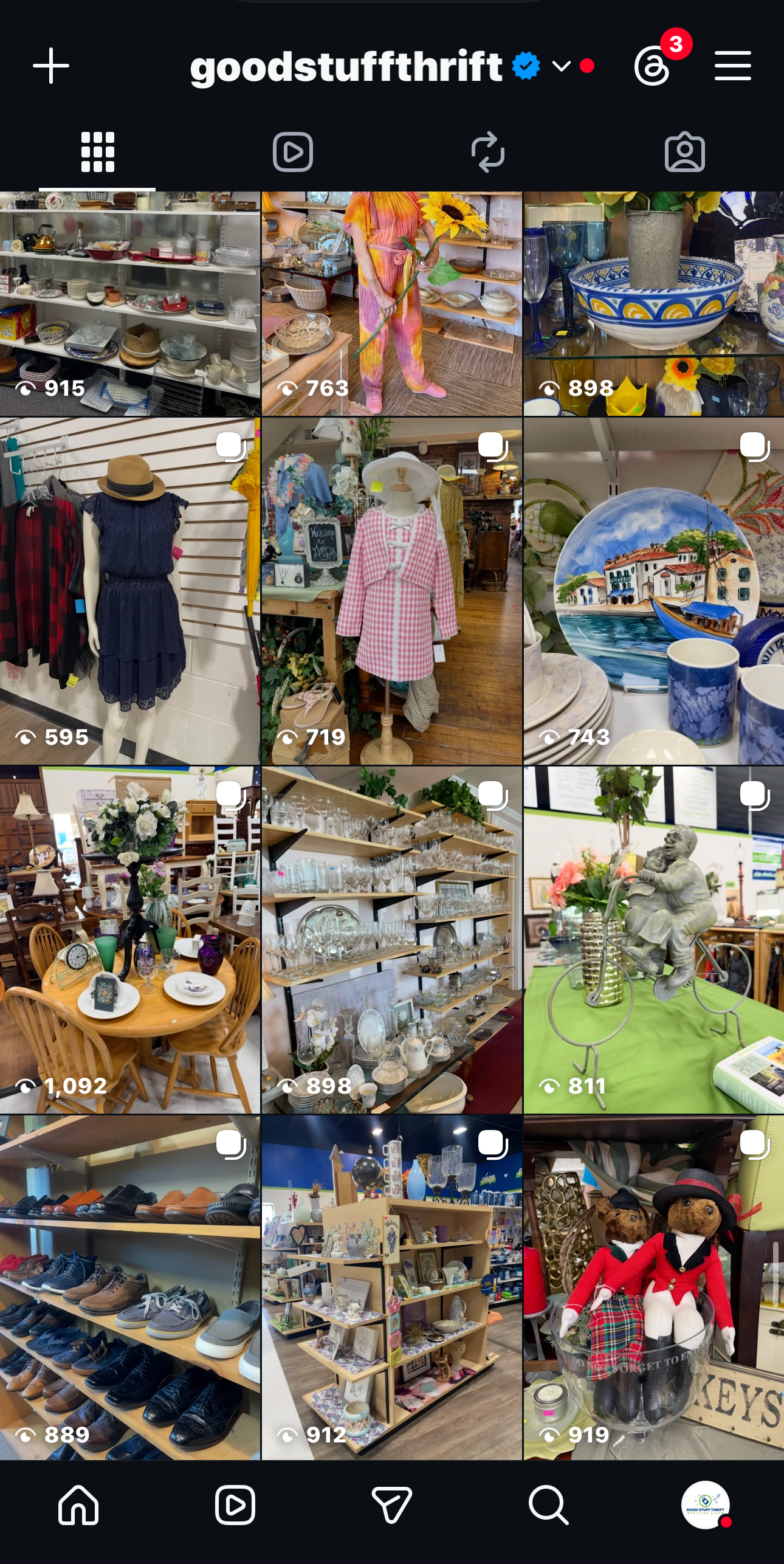
After
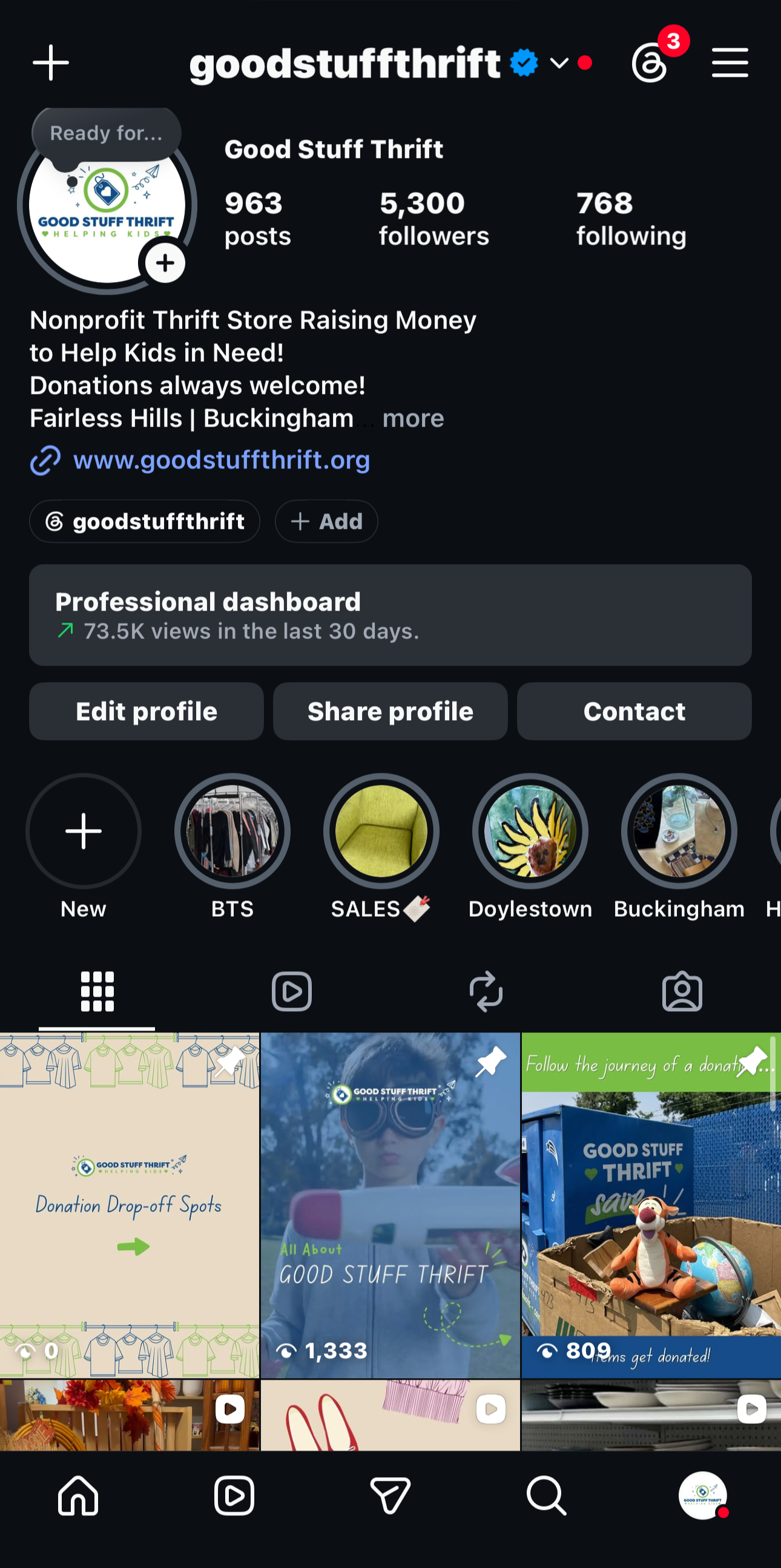
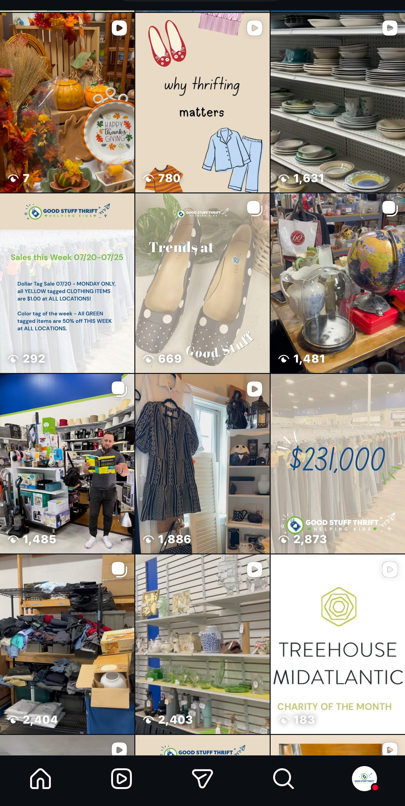
Good Stuff Thrift
In this role, I focused on creating engaging, informative, and brand-centered content that strengthened the organization's online presence. By developing cohesive brand colors, messaging, and visual themes, I helped create a consistent identity that resonated with the audience and made a meaningful impact within my first month.
Analytics
Engagement +124%
Views +44.8%
Follows +146%
Reach +56.4%

Apple Mock Campaign
Relaunch of the iPod touch
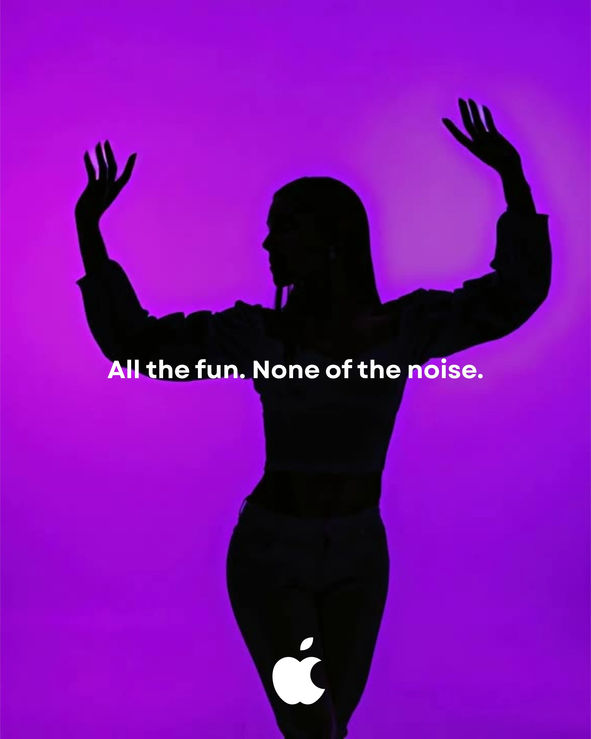
iPod Touch Relaunch
Campaign Goal
Reposition the iPod Touch as the anti-smartphone: a device for kids and "digital minimalist" adults that delivers music, photos, apps, and connectivity — without the endless pings, social feeds, and pressure that come with a phone. The goal is to carve out a new category: a "safe, focused device" for a moment when parents and even adults are actively looking to cut down screen anxiety.
Target Market
Primary: Parents of tweens (8–13)
They want their kid reachable and trackable (location, calling, texting) but are wary of handing over a smartphone with social media, endless scrolling, and unfiltered internet access at a young age. The iPod Touch fills the gap between "no device" and "full smartphone."
Secondary: Gen Z/Millennial minimalists
People doing dumbphone swaps, screen-time detoxes, or wanting a dedicated music/camera device without notification overload. This group is smaller but culturally loud — they drive earned media and social proof.
Why This Works
The tension is real and current. There's a growing backlash against smartphone use in kids (school phone bans, "Anxious Generation"-style parenting conversations, dumbphone trend among adults) — this campaign rides an existing cultural wave rather than manufacturing demand from scratch.
Clear differentiation. Instead of competing with the iPhone on features, the iPod Touch competes on restraint — it does less, on purpose, and that's the selling point.
Solves two audiences' opposite needs at once. Kids get independence and fun (music, camera, games, messaging friends); parents get safety features (location sharing, contact controls, no app store surprises) without the social media minefield.
Low cognitive load message. "A phone without the noise" or "All the fun, none of the notifications" is simple enough for a tagline, a 15-second video, or a single print visual — very portfolio-friendly.
What would this look like?
The visual identity draws inspiration from Apple's iconic early 2000s advertising campaigns, incorporating bold colors, striking silhouettes, and energetic compositions. This nostalgic approach immediately captures the attention of audiences familiar with the original campaigns while offering a refreshing contrast to Apple's current minimalist aesthetic. By revisiting a beloved era of the brand, the campaign positions the relaunch as a celebration of Apple's creative legacy—showing that sometimes taking a step back can be the most forward-thinking move.
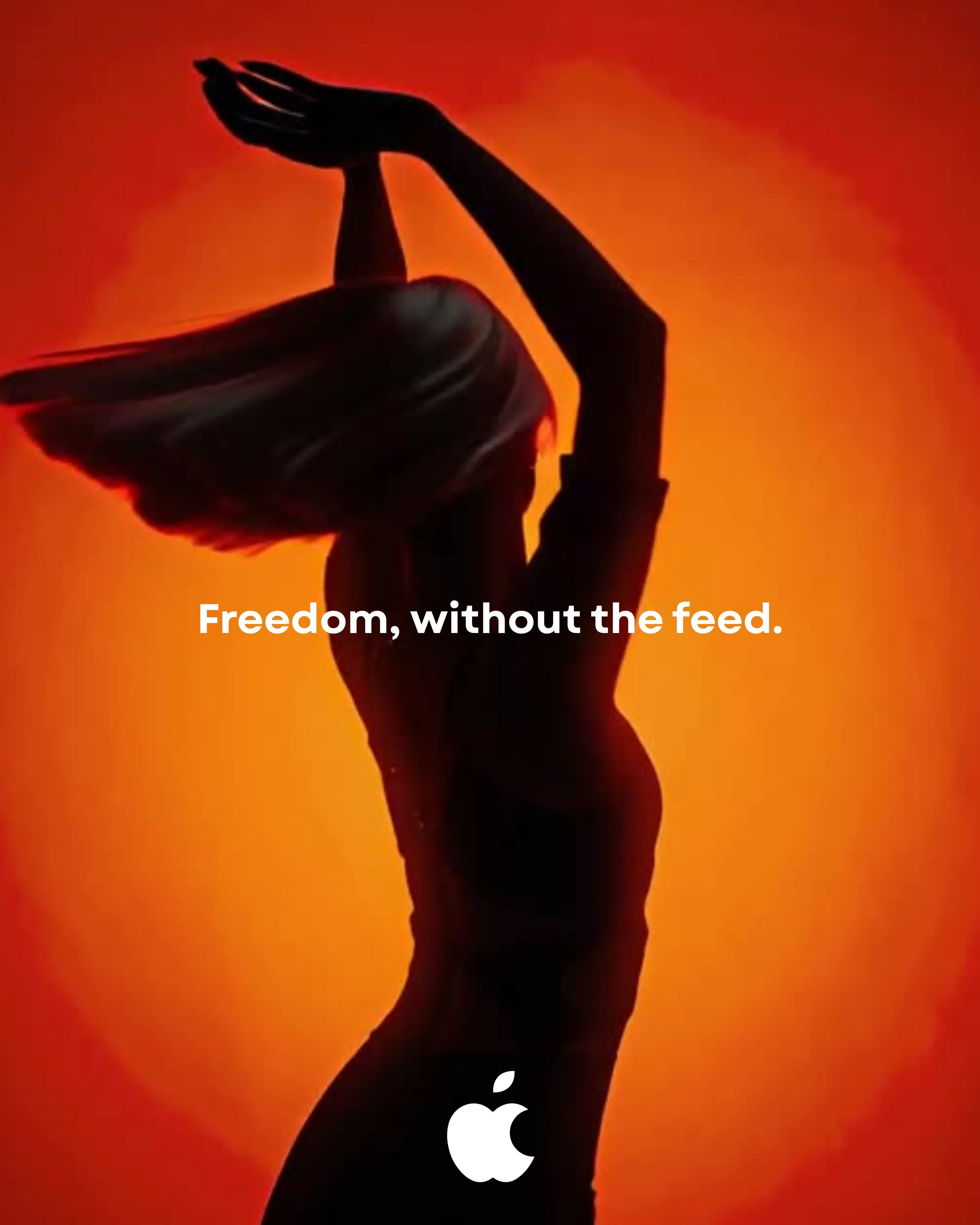
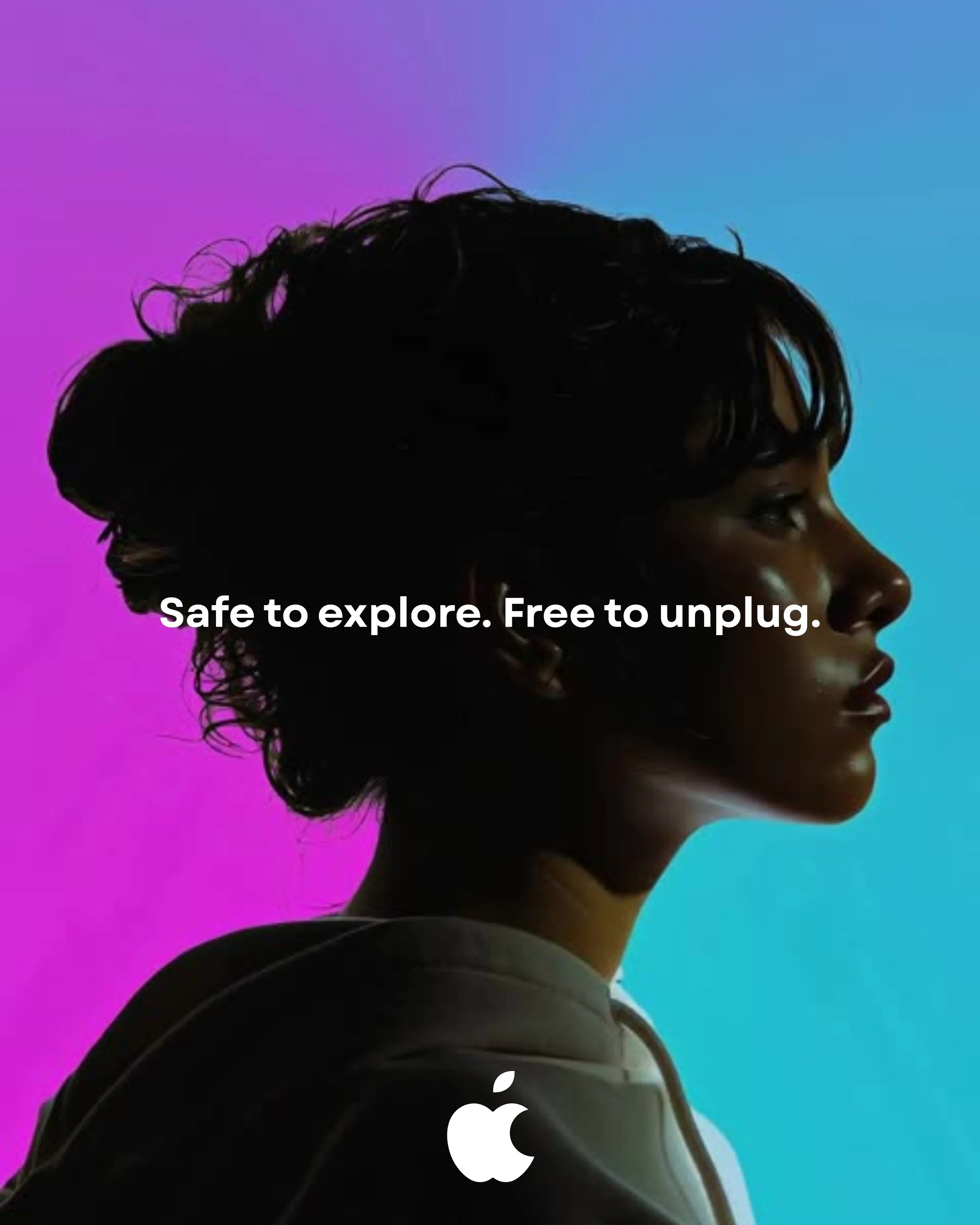
Social
Pizza Da Franco
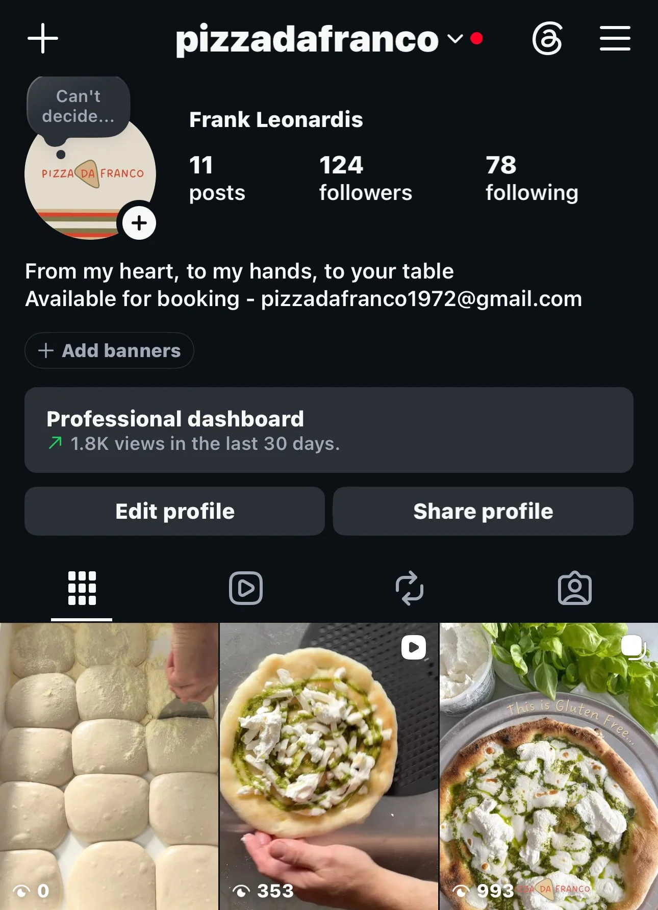
Analytics
Engagement +86
Views +1.8K
Follows +8
Reach +506
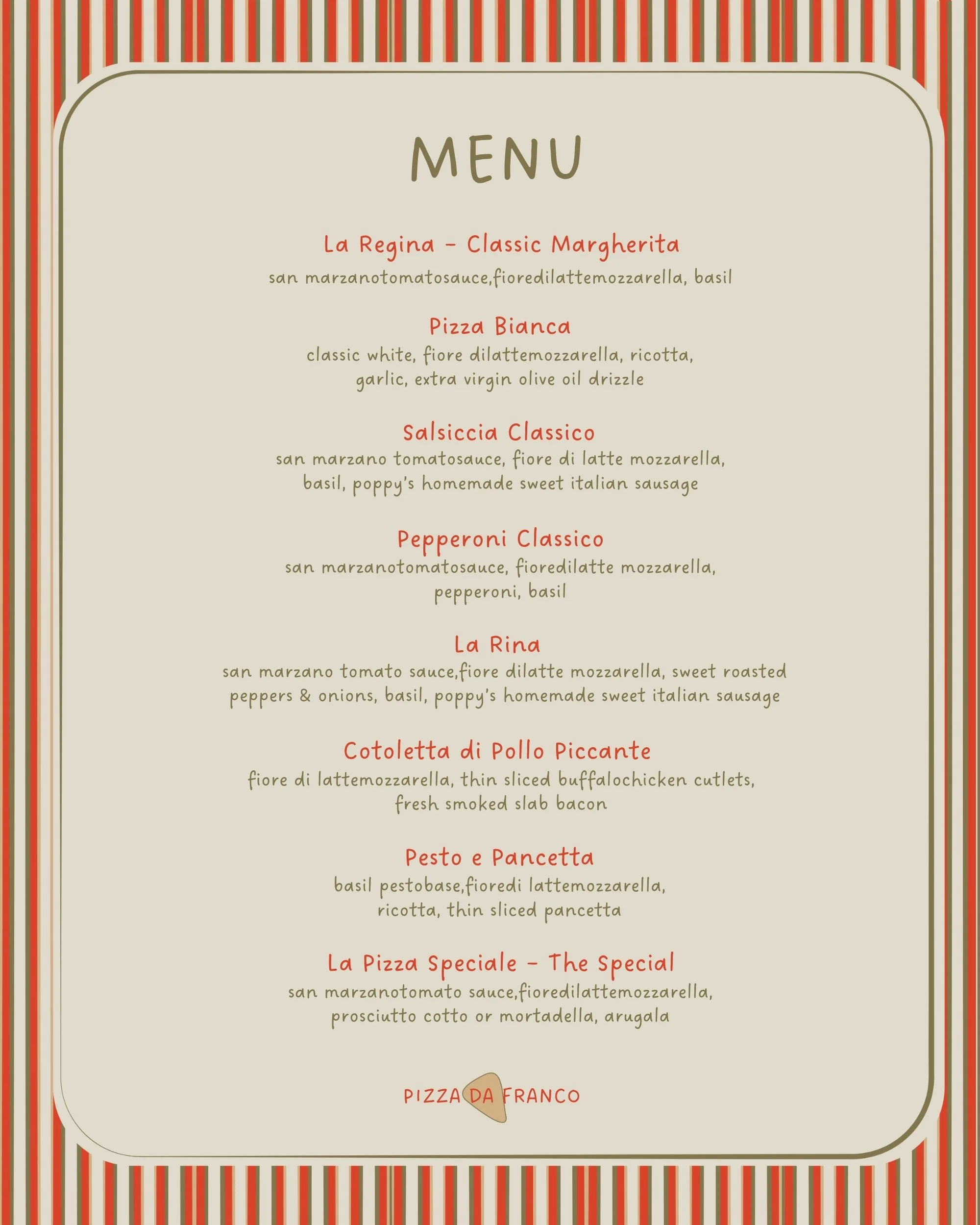
Sample Menu
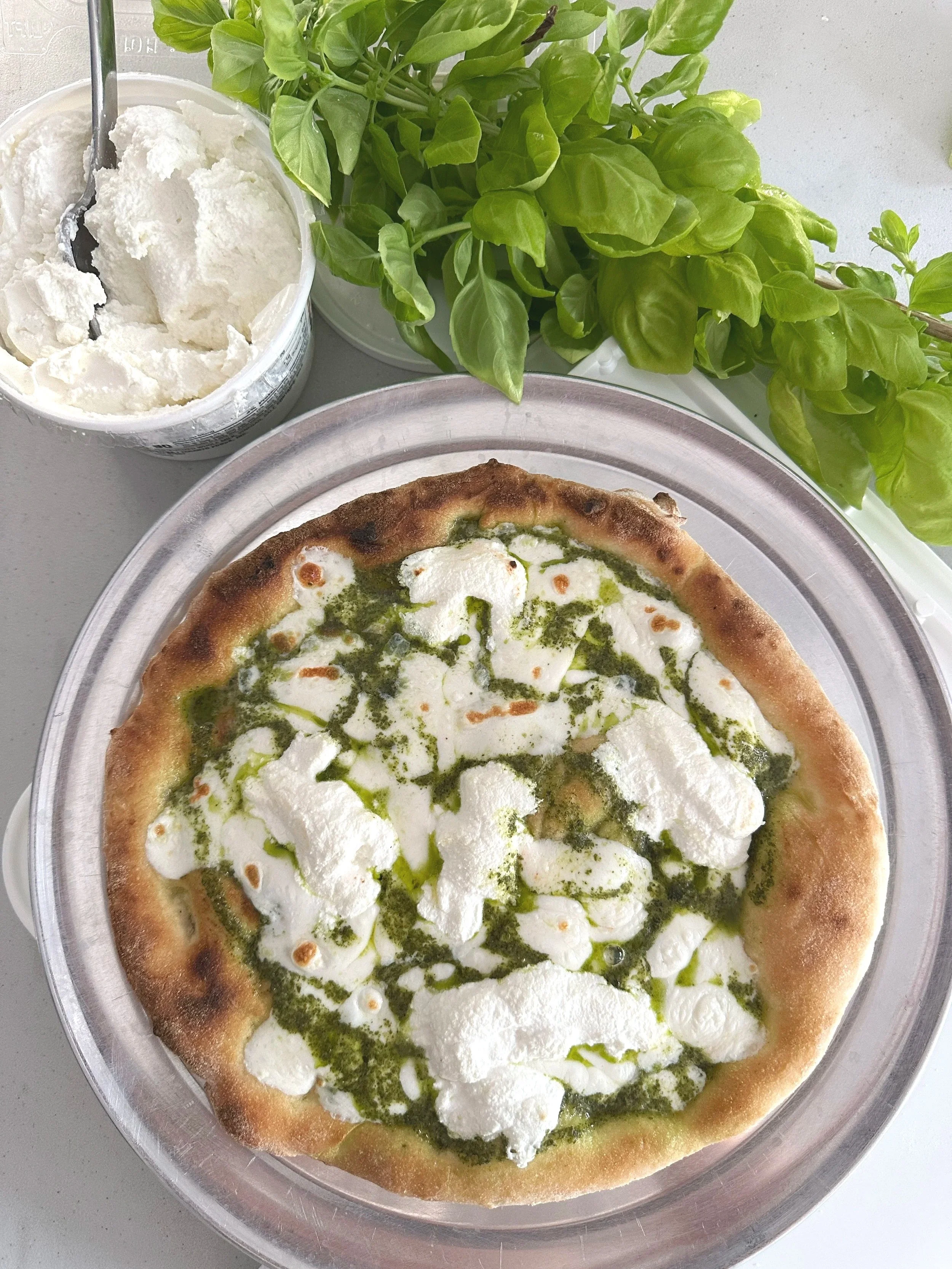
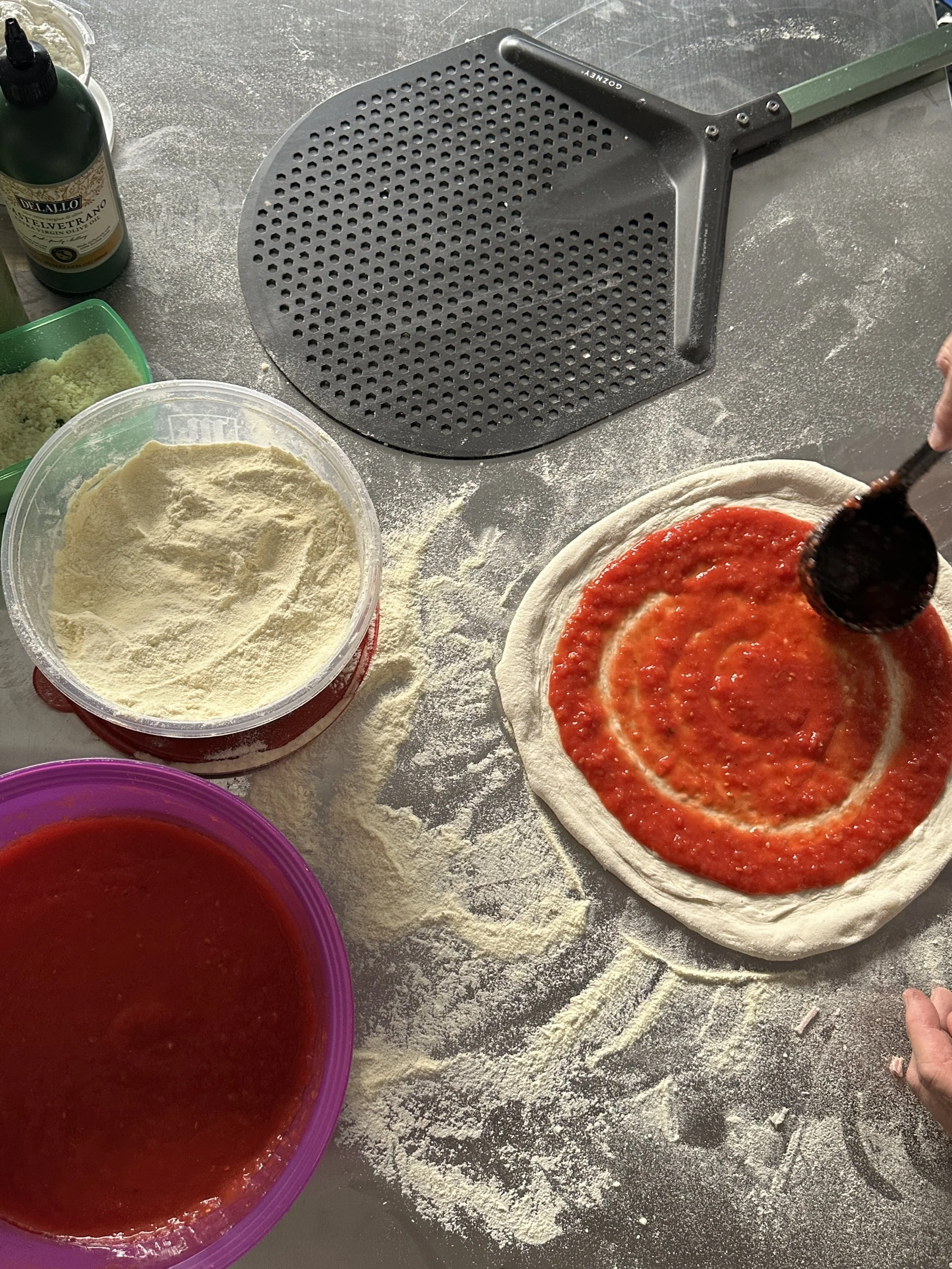
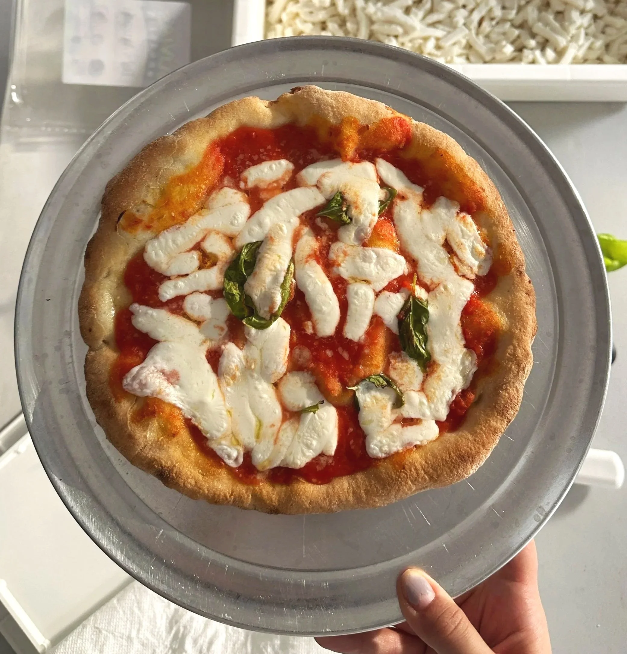
Brand Photography
Brand elements


Logo

Beginning with no existing brand identity, I developed a complete branding and social media strategy from scratch (no pun intended). From defining the visual identity and brand voice to planning content themes and digital campaigns, I created a strong foundation for a consistent and engaging online presence.